Why Most Apps Lose 95% of Their Users (And How the Winners Beat Those Odds)
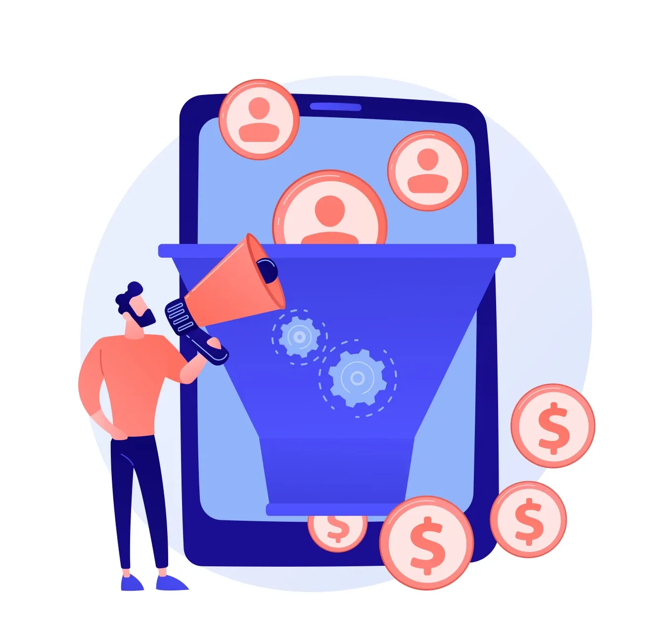
Every day, roughly 300 new apps land in the App Store. Yet only a vanishingly small percentage of them achieve meaningful traction, revenue, or retention. At Flywheel Studio, we've spent six years building mobile applications and studying what separates the winners from the also-rans. The statistics are sobering: most apps lose 95% of their users within the first 30 days, and a staggering 77% abandon the app within just three days of installing it.
These aren't minor setbacks. They're existential challenges that make it nearly impossible for even well-funded apps to sustain growth. When your 90-day retention hovers around 1.7%, the unit economics of customer acquisition simply don't pencil out. Marketing dollars evaporate. Growth stalls. The dream fades.
But some apps do win. Applications like Duolingo and Freeletics have cracked the code on retention, engagement, and long-term value creation. In a recent webinar, we explored what these category leaders do differently—not by building more features, but by using their features more strategically. What we discovered isn't about adding complexity. It's about intentional design choices that center the user's outcome, not just their engagement.
The Core Problem: Features Don't Equal Value
Most applications operate on a dangerous assumption: if we build enough features and make them available, users will discover value on their own. Download our app, explore the interface, figure out what works for you, and integrate it into your life. Good luck.
This approach fails spectacularly in practice. Users don't have infinite patience or attention. When an app asks them to do the heavy lifting of discovering value, they delete it and move on. The best apps flip this dynamic entirely. They don't just provide tools—they actively shepherd users toward experiencing value from the very first session.
Consider Duolingo's approach. When you open the app after being away for a while, it doesn't show you a dashboard of options or ask what you'd like to do. It opens directly into a lesson. The app is essentially saying, "We know why you're here. Let's get you to value immediately." This seemingly small design choice has profound implications for retention. It removes friction, eliminates decision paralysis, and gets users to their "aha moment" faster.
Lesson One: Push Notifications Done Right
Push notifications are table stakes in mobile apps. Everyone knows they're important for driving re-engagement. But the best apps approach notifications with surgical precision, not spray-and-pray tactics.
Duolingo has turned push notification strategy into an art form. First, they use timing based on user behavior patterns. The app learns when you typically complete lessons during the day—maybe it's during your morning commute or your evening wind-down routine—and sends reminders during that window. They're not interrupting your workday at random. They're nudging you when you're most likely to be receptive.
But here's the crucial insight that most developers miss: the effectiveness of those notifications is built on a foundation of user commitment. Early in the onboarding flow, Duolingo asks users to commit to a goal. Do you want a 7-day streak? A 50-day streak? You, the user, choose your commitment level. The app doesn't impose it.
This self-authored commitment transforms everything. When Duolingo sends that reminder notification, it's not nagging you to use an app you downloaded on a whim. It's reminding you of a goal you set for yourself. As one internal framework document might put it: a self-authored commitment is the upstream of every notification that works. When users commit first, reminders become helpful accountability rather than unwanted intrusions.
Lesson Two: The Home Screen Treaty
Your phone's home screen is precious real estate. Users are ruthlessly selective about what stays and what gets deleted. This creates what we call the "home screen treaty"—apps need to earn their place by providing ongoing value, not by demanding payment upfront.
Freeletics, a fitness app we admire, understands this dynamic brilliantly. You can download Freeletics and use it for free, forever. You get access to workouts, exercise guides, diet information, and a community of users. It's genuinely useful without paying a cent. But if you want the AI-powered coach that creates personalized workout schedules and adapts to your progress over time, then you upgrade to the paid tier.
This strategy accomplishes several things simultaneously. First, it removes the barrier to initial adoption. Users can try the app without financial commitment. Second, it allows users to find value on their own timeline. Not everyone discovers the full potential of a fitness app in a seven-day trial period. But give them a free tier they can explore at their own pace, and many will eventually realize they want more.
Third—and this is often underestimated—free users become organic brand ambassadors. Freeletics gets shared in online communities, forums, and social media precisely because anyone can download it and start using it immediately. Those free users don't generate direct revenue, but they create enormous brand value and reduce customer acquisition costs over time.
The alternative approach—hitting users with a paywall immediately after download—creates a very different dynamic. You're essentially asking people to make a purchasing decision before they've experienced any value. Some apps can pull this off, particularly if they have strong brand recognition or offer something genuinely unique. But for most apps, especially those trying to build habits, the free tier strategy is vastly more effective at earning that coveted spot on the home screen.
Lesson Three: Design for Cadence, Not Maximum Engagement
This is perhaps the most counterintuitive insight we've uncovered, and it runs against much of the conventional wisdom in the app development world. The reflex is always to maximize engagement—more sessions, longer sessions, higher daily active user counts. But maximizing engagement without regard to user outcomes is a recipe for creating addictive, low-value products.
Here's a striking statistic from the digital health space: the correlation between user engagement and actual clinical outcomes is just 0.16. That's 16%. In other words, apps can be wildly successful at driving engagement while delivering almost no real benefit to users. That's not a sustainable model. Users eventually realize they're not getting results, and they churn.
The solution is to match your app's cadence to the user's desired outcome, not to maximize usage frequency. Some apps genuinely should be used daily—language learning through Duolingo, for instance. The science of language acquisition supports daily practice for building fluency. A daily cadence makes sense.
But other apps have entirely different natural rhythms. Travel apps aren't daily-use products for most people. If you tried to gamify a travel app to encourage daily usage, you'd create an annoying, value-destroying experience. Women's health apps tracking menstrual cycles operate on monthly cadences. Financial planning apps might have weekly check-in rhythms but intensive monthly review sessions.
The framework we use considers seven key elements when designing app cadence: outcome, cadence frequency, behavioral triggers, user commitment, reinforcement mechanisms, progress tracking, and recovery design. Each of these needs to align with the actual outcome the user is trying to achieve.
When you get the cadence right, retention becomes a proxy for outcomes. When you get it wrong, retention becomes a proxy for addiction. We've seen too many apps in the marketplace that have engineered habit loops without engineering actual value delivery. Those apps might show impressive engagement metrics in the short term, but they inevitably face backlash, poor reviews, and ultimately, failure.
The Dark Patterns We Avoid
Let's be clear about what sophisticated gamification doesn't include. At Flywheel Studio, we have hard lines we don't cross. We don't use predatory monetization tactics like pay-to-skip timers that make the free experience deliberately painful. We don't manufacture artificial scarcity or use deceptive design patterns that trick users into subscriptions.
We're also thoughtful about social pressure. While Duolingo's use of guilt-based messaging around streak maintenance can be effective in certain contexts, it can also be harmful, particularly in mental health applications. The line between helpful accountability and manipulative pressure is real, and it matters.
This isn't just about ethics—though that's reason enough. It's also pragmatic. Dark patterns might juice short-term metrics, but they poison long-term brand equity. They generate negative reviews, regulatory scrutiny, and user backlash. The apps that build enduring value are the ones that genuinely help users achieve meaningful outcomes.
Practical Takeaways You Can Implement
If you're building or managing a mobile app, here's what you should do differently starting today:
Stop optimizing for daily usage if it doesn't match your user's outcome. Pick the right cadence for your app's purpose and design everything around that rhythm. Your metrics should reflect whether users are achieving their goals, not just how often they open the app.
Build a real free tier, not just a demo. Give users meaningful value without payment, but create clear upgrade paths for those who want more. The free tier earns the home screen; the paid tier earns the long-term relationship.
Earn the commitment, then send the reminder. Don't blast push notifications and hope for the best. Build user commitment first through onboarding that helps users articulate their own goals. Then your notifications become helpful accountability tools rather than annoying interruptions.
Design for the trough, not just the peak. Every user's journey includes down periods—moments when motivation wanes, when results plateau, when life gets in the way. Your app needs recovery mechanisms built in. Whether it's streak freezes, encouraging check-ins during breaks, or celebrating small wins during hard times, design for the full arc of the user experience.
The apps that win in today's brutal marketplace aren't necessarily the ones with the most features or the biggest marketing budgets. They're the ones that understand a fundamental truth: engagement is just a diagnostic. Outcomes are the goal. When you design with relentless focus on helping users achieve real results, retention follows naturally. The math starts to work. Growth becomes sustainable.
We've seen it happen with the apps we build, and we see it in the category leaders we study. The opportunity is there for any app willing to make user outcomes the true north of their design philosophy.